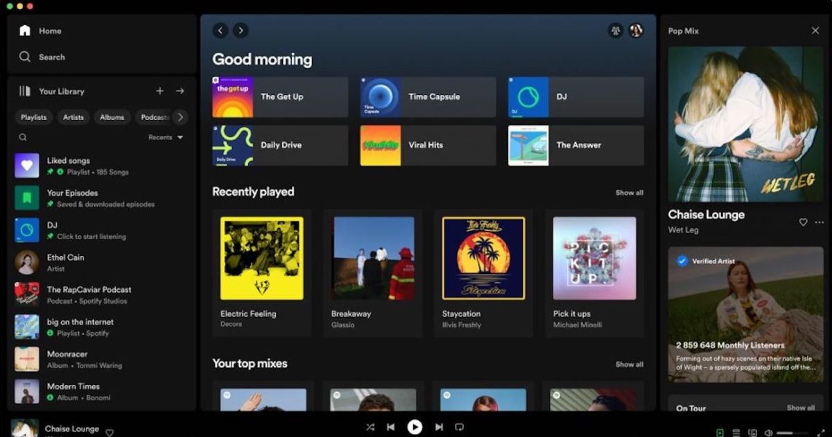
Spotify has updated the desktop app with plenty of visual improvements and new features, like a “now playing” view that gives you immediate access to merchandise and tour dates.
I despise the new library view, I cannot just double click my playlist folder to start playing anymore, I have to right click and go down to the play option now… Also feels very massive like it wasnt made for a mouse pointer. If it were up to me i’d revert to the old one in a heartbeat.
It’s almost impressive how badly they screwed up the library. Absolutely hate it. It’s just a massive chore to use versus how it was.
deleted by creator
Huh? I had the redesign for a few weeks already and I can still double click playlists in my library. Only annoying issue I’m having is a wide unnecessary black bar when using spotify in full screen on MacOS.
It gets worse every update
Spotify is peak change for the sake of change. They like tinkering with the UI for no discernible reason.
Fidgety corporate ADHD. Constantly breaking things that used to work and now they don’t, all across the extended ecosystem (such as Alexa). Some assholes trying to justify their salary as the clueless and mesmerized suits go along with it, this is “metrics” anti-culture they’ve created. High-fiving themselves and giving themselves bonuses, for making things palpably enshittified.
It also sounds kinda like Lucas with the Original Trilogy.
Yep! I left a while ago and moved to Tidal. I’ve been relatively happy with it so far.
Yay! Another enshittified product to replace with a federated one! @funkwhale here I come …
Dont forget that Spotify abuses its market position by basically milking smaller artists dry.
Does anybody know of a good alternative that doesnt involve either storing hundreds of albums on CD or piracy?
Bandcamp is a nice alternative, but much more limited to smaller artists and labels.
i have made a point of paying for music that i DJ with for over a decade. bandcamp as a website has been a huge part of that. it’s bloody amazing.
Qobuz and Tidal are less evil than Spotify and support higher quality audio, but also have smaller selections. Where practical I’ll buy albums I like on FLAC from Bandcamp or HDtracks but it is also nice to have a streaming service for discovering new stuff.
7digital is a pretty good DRM-free digital music store, and they even have lossless music. They don’t have everything, but their catalog is pretty huge.
Admittedly you would have to be pretty rich to buy all the music you want to listen to, but if you have an Android phone, I’m pretty sure there are apps you can use to stream from YouTube Music or Spotify without a subscription.
Personally, I’m poor and lazy, so I just stick with Apple Music. Anything they don’t have, I just upload to my library.
ViMusic
Deezer has been my less evil Spotify alternative.
So tired of Spotify changing shit up constantly. I would’ve switched to Apple Music a long time ago if they’d just implement Chromecast support on their damn iOS app (doubt it will ever happen). Everyone on my family plan is too invested in Chromecasts/Google Speakers to swap over to AppleTVs/HomeHubs
Seeing this makes me realize how little I actually use Spotify. Not to say the Desktop redesign looks bad but my only usage of Spotify is through their mobile app on Android. Since I never used the Desktop app before the redesign I can’t say if its bad or not. Most, if not all, of my music listening is through either SoundCloud or Youtube.
deleted by creator
Great to see some improvements. Hopefully it doesn’t overly clutter the UI. On a side note, has anyone found the new AI DJ useful? Mine keeps playing k-pop even though I rarely if ever listen to k-pop. I’ve found myself just going back to daily mix 1.
I have found no substantial difference between the DJ and the Daily Mix playlists. They both just play way too much of the exact same songs that Spotify has pushed at me for years.
Such an improvement in my opinion. 90% of the time I am browsing my playlists. Now, instead of getting 20% of the screen space, they get a generous 70% almost! This small change makes me want to use Spotify desktop again.
I have no idea how they came to this decision, or whether it’s I’m in the majority, but it makes me wonder: did they finally start to use the app usage analytics to improve their UX? Like looking at the most used functions in their app.
My desktop client is busted as it’s stuck in the previous iteration of the UI.
I really despise their constant UI updates.
Anyone from r/truespotify here? Lol.
I have a lot of mixed feelings about Spotify’s UI choices, but I guess this is what Spicetify is for. 😅
For anyone not getting the update, apparently my installation was fucked and merely switching to the Windows Store version unfucked it.
Now I have the new UI!… And it’s awful lol
I like it. It looks much cleaner.
One of the reasons I stopped using Spotify was the rather regular UI changes
Sounds like a good time to switch to resonate. There’s (sadly) not that many artists there yet, but the pricing model is really cool (and doesn’t exploit tne artists as much). And I guess the only way a platform like this will get more artists, is if it gets more listeners :)


